Landing Page Optimization

The Hidden Truth About Landing Page Optimization Most Businesses Miss

Published by abraham • April 8, 2025

Landing page optimization in digital marketing can boost conversion rates by up to 200%. Many businesses still miss significant opportunities to improve their pages. Users dedicate 57% of their viewing time above the fold, and 95% of potential customers read online reviews before they buy.

Landing page optimization goes way beyond simple design elements and A/B testing. Successful landing pages need a deep understanding of visitor psychology, trust-building elements, and value proposition arrangement. This piece uncovers the hidden psychological triggers that drive conversion rates. It also reveals common mistakes that quietly hurt business growth through landing pages.

The Psychology Behind Landing Pages Most Businesses Ignore

Businesses often pay attention only to how their landing pages look in their digital marketing strategy. They don’t realize that psychological triggers are what actually drive conversions. Our decisions come from complex brain functions that marketers can use to create pages that convert better.

How visitor emotions drive conversion decisions

Almost all human decisions have emotions at their core. Many marketers think consumers make rational buying choices. Research shows that emotions substantially affect and often determine our decisions. The truth is simple—customers make gut-level decisions. Their buying actions come directly from changes in their emotional state.

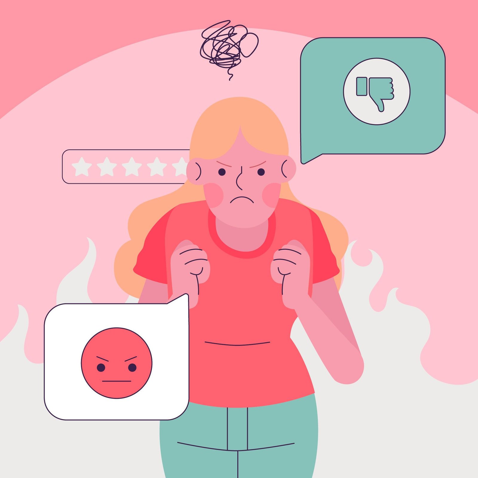
So, landing page conversion rate optimization depends on triggering the right emotions. Negative emotions create the strongest responses. A study of 70 million messages found anger to be the most powerful emotional trigger. This explains why loss aversion tactics work so well. People prefer avoiding losses over getting something new. Studies suggest losses can be twice as powerful as gains in our minds. Landing page designers should add:

  • Social proof elements that tap into customers’ trust in others’ opinions
  • Security signals that build visitors’ confidence in their decisions
  • Emotional imagery that connects with visitors’ dreams
  • Clear solutions to specific pain points that appeal to target audiences
emotions affecting actions
The 3-second rule of first impressions

You have very little time to capture visitor attention. Studies show users take just 50 milliseconds (0.05 seconds) to form an opinion about your website. You have only 3 seconds to make a strong first impression that keeps visitors on your page.

Research suggests first impressions depend mostly on design—94% of website feedback relates to design elements, not content. Bad interface design makes visitors reject and mistrust a website quickly. They rarely look beyond the homepage if they don’t like what they see.

Visitor eye movements focus on specific page sections within 2.6 seconds. Better first impressions keep visitors on the page longer. On top of that, visitors spend 57% of their time above the fold. This makes this area crucial for landing page optimization services.

Why rational arguments often fail to convert

Marketers focus on logical selling points, but rational arguments alone rarely convert. Our brain stays in non-thinking mode 95% of the time. This makes people more likely to respond to emotional appeals than rational ones. That’s why detailed feature lists and technical specs don’t convert as well as emotional messages.

Research from the Advertising Education Foundation shows marketing messages work best when they excite singular expectations, dreams, hopes, or beliefs of the target audience. Successful landing pages don’t overwhelm visitors with information. They show what visitors might lose if they don’t sign up or buy.

A/B testing can mislead businesses when they look only at surface-level metrics without understanding emotional drivers behind conversions. The best approach starts with emotional appeal—how humans naturally think—and backs it up with rational facts. This mix creates landing pages that work on both gut and intellectual levels, making website landing page optimization much more effective.

Why Traditional Landing Page Advice Falls Short

The reality of landing page optimization is not what most people think. Many businesses spend money on optimization services but end up disappointed. Cookie-cutter advice rarely delivers the promised results.

The biggest problem with generic best practices

Standard landing page practices don’t work because they ignore what today’s consumers really want—personalization. Users feel overwhelmed when pages bombard them with too much information or choices. This frustrates them and makes them leave. Mobile users especially need clean, simple interfaces.

The numbers tell a concerning story. Social media visitors bounce away roughly half the time when they land on these generic pages. The root cause? Many pages try to do too many things at once. Landing pages should have one focus, one goal, and minimal distractions. Yet companies keep stuffing their pages with different content types, signposts, and mixed messages. Traditional landing pages fall short because:

  • They target everyone instead of specific customer groups
  • The content doesn’t strike a chord with individual user needs
  • Pages take more than 2 seconds to load (just one extra second drops conversions by 7%)
  • Mobile optimization gets ignored, even though mobile devices generate more than half of all web traffic
issues with generic
A/B testing can be limiting

A/B testing helps, but it can sometimes point you in the wrong direction. Companies often jump to conclusions too quickly. You need thousands of visitors to get meaningful results, but many businesses make decisions based on just 200 visitors. Quick tests that run for only a week rarely give reliable insights.

Good A/B tests need solid hypotheses. This is the foundation of website landing page optimization. Many companies skip this crucial step or create vague statements that don’t mean anything. Tests without data-backed hypotheses become random experiments with questionable results.

Companies often stop tests too early. Testing platforms declare winners at 95% confidence level without considering visitor numbers or conversion rates. This creates false positives that don’t last. Experts say each variation needs at least 500 conversions and two weeks of testing time.

Outside factors like market changes, competitor actions, and traffic patterns can mess up your results. Running tests for no more than 30 days helps prevent data contamination while gathering enough information.

Landing page conversion optimization success starts with understanding these limitations. Best practices work as starting points—they’re not perfect solutions for your unique audience and business goals.

Hidden Psychological Triggers That Boost Conversion Rates

The psychology behind landing page design goes far beyond what meets the eye. These hidden psychological triggers can substantially change conversion rates. High-performing landing pages stand out from average ones because they employ these lesser-known factors.

The power of social proof beyond testimonials

Testimonials add value, but advanced social proof techniques create stronger trust bonds with visitors. Studies show that displaying actual customer numbers (like Shopify’s “over 1.7 million customers”) taps into crowd wisdom, which triggers FOMO and herd behavior. Visitors feel more confident in their decisions when they see others making similar positive choices.

Immediate purchase notifications can boost conversions up to 15%. These visual signals of ongoing activity create urgency and show that others consistently value your product.

Trust badges do more than just display certification logos. The best landing pages include objective third-party reviews that seem unbiased, which creates a powerful ripple effect for prospects. Research shows that people connect better with faces than numbers, so testimonials with headshots and titles are much more effective at building trust.

Loss aversion: why FOMO works so well

People feel twice as strongly about avoiding losses compared to gaining something new. This psychological principle—loss aversion—offers a great chance to optimize landing page conversions. The best landing pages highlight what customers might lose instead of just focusing on benefits. Here’s how to use loss aversion:

  • Limited-time offers create urgency
  • Early-bird specials show diminishing value over time
  • Discounts framed as avoiding losses rather than gaining savings
  • Solutions that prevent wasted time or money

Loss aversion marketing sparks emotional responses that push consumers to act quickly to avoid missing out. This explains why well-executed FOMO campaigns consistently beat benefit-focused marketing in conversion tests.

FOMO
Color psychology: beyond simple button tests

Colors influence 85% of purchase decisions and boost brand recognition by 80%. Most businesses choose colors randomly instead of strategically.

Different colors trigger specific psychological responses. Red sparks urgency and raises heart rates—perfect for sales and time-limited offers. Blue creates trust and calm, making it ideal for financial and healthcare services. Green signals positive action, which helps visitors focus and decide faster.

Contrast matters more than individual colors. High-contrast elements highlight key conversion points, and well-contrasting call-to-action buttons get more clicks.

The paradox of choice: when fewer options convert better

You might think more options help customers, but research proves otherwise. Too many choices lead to decision paralysis.

This principle demands focused landing pages. Pages with multiple CTAs perform worse than those with a single focus. Forms with fewer fields get completed more often.

“Buyer’s remorse” increases when people face too many options—customers doubt their choices more with more alternatives. The key to effective landing page optimization is simple: less converts more.

Website Landing Page Optimization Through User Journey Mapping

User journey maps show crucial emotional and psychological states visitors go through while navigating landing pages. This blueprint helps optimize pages in ways many businesses miss. Traditional landing page optimization focuses on metrics, but journey mapping lets us take a closer look at the visitor’s complete experience from their first awareness through conversion.

Identifying emotional touchpoints

Customer journey maps form the backbone of exceptional experiences by showing every interaction from the customer’s view. A map that works captures both actions and emotions at each touchpoint. It highlights positive and negative aspects of the experience. Research proves emotions drive customer decisions in any discipline of interaction. Businesses should follow these steps to spot emotional touchpoints:

  • Track the complete path from first awareness to post-conversion
  • Document emotional highs and lows at each interaction point
  • Measure how much each touchpoint matters
  • Get different team views to spot inconsistencies

The well-known Starbucks customer journey map shows this approach perfectly. It details emotional states right from when customers think over buying coffee.

Identifying emotional touchpoints
Lining up page elements with user mental states

Users build mental models—internal pictures of how systems work—based on past experiences with similar websites. These models help them predict how your landing page works before they even use it. Users feel confused and frustrated when your landing page doesn’t match what they expect.

Landing pages don’t deal very well with gaps between user mental models and actual design. To name just one example, see how users expect familiar design patterns and feel lost when navigation breaks from standard conventions. Landing pages must keep campaign momentum going. They should repeat offers from ads to the landing page without breaking communication.

Creating momentum toward conversion

A landing page’s success depends on building a smooth path to action. The best landing pages match their ads perfectly—using similar messages, design elements, and images to build trust.

Each page needs one clear goal with a single call-to-action. This removes distractions that could hurt conversion rates. Too many choices create decision paralysis and lower conversion rates.

Pages that convert well keep the momentum from the moment visitors click your ad. This means handling objections upfront, showing clear value, and removing anything that might slow down their path to conversion.

Common Landing Page Mistakes That Sabotage Trust

Trust is the foundation of online conversion. Many businesses hurt their chances of success through avoidable landing page mistakes. Even small oversights can create big trust barriers between potential customers and conversion goals.

Inconsistent messaging between ads and landing pages

Message match problems show up in landing pages where ads set expectations that pages don’t deliver. This mismatch creates confusion as visitors look for promised content they can’t find. Picture an ad promoting a sale while the landing page shows products without any mention of discounts—visitors feel cheated and leave.

The situation is like a restaurant advertising tasty burritos but serving plain rice when customers arrive. This disconnect wastes paid clicks and makes customer acquisition more expensive without generating conversions. Air Canada shows how to do it right by keeping their offers consistent between ads and landing pages, which builds visitor confidence.

Inconsistent messaging between ads and landing pages
Trust signals that actually decrease credibility

Trust elements can damage credibility when used incorrectly. Landing pages without testimonials or known customer logos look untrustworthy—much like an attractive restaurant with a “closed” sign out front. Notwithstanding that, adding trust signals without a plan often backfires.

Too many trust signals overwhelm visitors and weaken their effect, while irrelevant or exaggerated ones create doubt. Hidden trust elements generate mistrust. Trust signals work best when placed strategically near forms or calls-to-action to help boost conversions.

How overpromising damages long-term conversion rates

Landing pages shape long-term customer relationships beyond immediate conversions. Exaggerated claims might boost conversions temporarily but hurt brand perception once customers find out the truth.

Companies often oversell what they can deliver, forgetting that 95% of customers check online reviews before buying. Overselling gets spotted quickly and ruins repeat purchases and recommendations.

The real goal goes beyond single conversions. It’s about building lasting customer relationships through honest communication. Landing pages should set realistic expectations that match or exceed what customers experience after purchase.

Landing page optimization requires deeper insights than most businesses think. Design elements play a role, but successful landing pages come from understanding visitor psychology, building real trust, and creating smooth user experiences.

Many businesses make surface-level changes and miss their best chances to connect with their audience. Successful landing pages need careful attention to psychology, proper A/B testing, and well-placed trust signals instead of generic best practices.

Better conversion rates begin with a clear grasp of visitor emotions and mindset. Smart businesses know that fewer choices often work better. They place social proof strategically and keep their message consistent to build lasting customer relationships. These elements create landing pages that convert well and build long-term customer value.

Good landing pages mix psychological triggers with honest communication. The promised benefits must match what customers actually receive. This helps companies avoid common mistakes while building real connections with their audience. They end up growing steadily through better conversion rates.